

Color theory is both the science and art of using color. It explains how humans perceive color; and the visual effects of how colors mix, match or contrast with each other.
Color theory also involves the messages colors communicate; and the methods used to replicate color.
You can read more about color theory here if you are designer.
https://www.interaction-design.org/literature/topics/color-theory
There are several reasons why design and marketing professionals use color to define of create appeal of their brand or product.
Research reveals people make a subconscious judgment about a person, environment, or product within 90 seconds of initial viewing.
Between 62% and 90% of that assessment is based on color alone.
(Source: CCICOLOR - Institute for Color Research)
Consequently, catching the customer's eye and conveying information effectively are critical to successful sales.
The global color authority reveals its Color of the Year every December, and its 2023 choice, announced Thursday, is a vibrant relative of the red family. CNN called it unexpectedly bright.
Pantone says “It is a shade rooted in nature descending from the red family and expressive of a new signal of strength.
Viva Magenta is brave and fearless, and a pulsating color whose exuberance promotes a joyous and optimistic celebration, writing a new narrative.”
Perhaps this is the vibrancy Pantone is trying to push after a few very somber years for humanity.
Marketeers, creatives and brand designers need to take note of this collective emotion in addition to the color trends.
When you look closely at the magenta verse palette however, this is the only bright color with the rest of the colors following a very serene nature based theme.
As per the Excal Design research team, the 2023 color trends will also be reflected in real estate and fashion.
The main hues continue to lead towards reds, as other companies in different industries declare their chosen color for the coming year.
I firmly believe that some of these trends will inspire some classic palettes, that will look beyond 2023.
The color trends for 2023 are going to include:
Benjamin Moore pivoted away from the soothing shades of years past to proclaim "Raspberry Blush" as their official color of the year.
The decision denotes a greater movement within the interior design industry towards more saturated shades.
As mentioned earlier Pantone has picked “ Viva Magenta” as their color of the year.
Since Pantone is a color authority that defines color trends in fashion, paints or digital media, this color is going to be around next year in many ways; be it as an accent or theme color.
WGSN had predicted in 2020 that Purple will return as a key color for 2023, representing wellness and digital escapism.
Recuperative rituals will become a top priority for consumers who want to protect and improve their mental health, and Digital Lavender will connect to this focus on wellbeing, offering a sense of stability and balance.
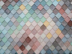
Warm neutrals will be a part of the top color trends for 2023. These embrace wellness and comfort. These are nature inspires greens or ochres, the trend is timeless and classic.
At the same time lend a calming effect to the overall color composition.
That's exactly why Behr named Blank Canvas as its Color of the Year for 2023. “White is the key to individual style simply because it’s so easy to change up,” says Erika Woelfel, vice president of color and creative services at Behr.
Instead of the cooler tones we've seen in the past, today's neutrals embrace a warmer disposition with earthy undertones.
A true and earthier example of this trend is Sherwin-Wiliams's 2023 Color of the Year
The colors will have darker undertones to provide depth. This may be limited to real estate and digital, but only time will tell.
As a part of their Color Trends Forecast, Benjamin Moore highlights Wenge, a deep chocolate with notes of violet and black, as a great alternative to black.
Author: Shubhra Bhargava, Chief Design Officer
Shubhra is the head of design for Excal Design. and VP - Design and Marketing for ExcalTech. She is a branded-environments specialist with experience in design, CMS, User Interface, general management, brand and retail identities.
Some of the brands she has worked with in leadership positions include: Future Group, Levi Strauss, United Colors of Benetton and Reliance Retail.